UI shell header
Color
The UI Shell can be customized to use any of the four IBM themes by applying an inline theme to the shell zone.
| Element | Property | Color token |
|---|---|---|
| Header | background color | $background |
| border-bottom | $border-subtle | |
| Product name | text color | $text-primary |

Menu
| State | Property | Color token |
|---|---|---|
| Enabled | svg | $icon-primary |
| Hover | background color | $background-hover |
| svg | $icon-primary | |
| Focus | border | $focus |
| Active | background color | $background-active |
| svg | $icon-primary |
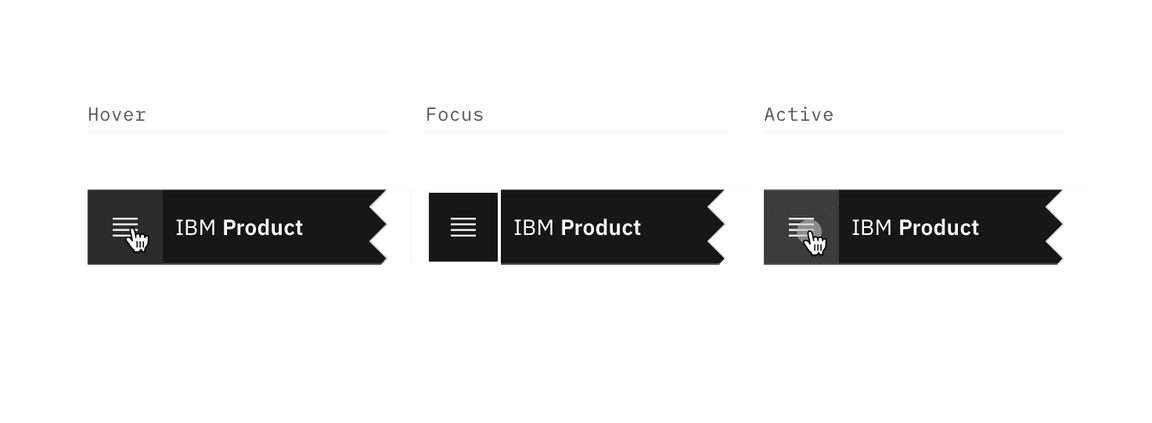
Menu-trigger interactive states
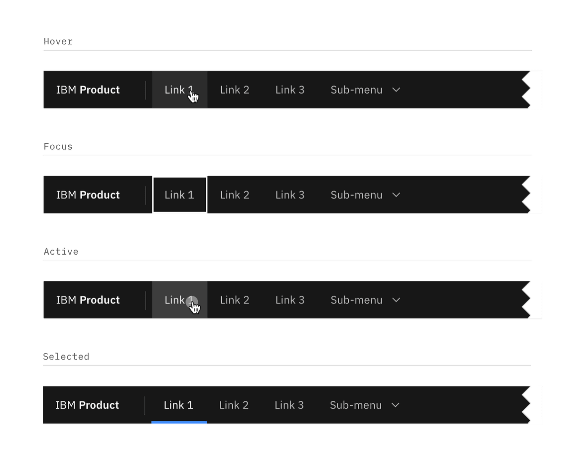
Header link
| State | Property | Color token |
|---|---|---|
| Enabled | text color | $text-secondary |
| Hover | background color | $background-hover |
| text color | $text-primary | |
| Focus | border | $focus |
| Active | background color | $background-active |
| text color | $text-primary | |
| Selected | background color | $background |
| text color | $text-primary | |
| border-bottom | $border-interactive |
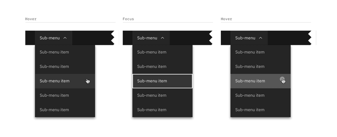
Sub-menu interactive states
Sub-menu
| Element | State | Property | Color token |
|---|---|---|---|
| Sub-menu | Enabled | background color | $background |
| text color | $text-secondary | ||
| svg | $icon-secondary | ||
| Hover | background color | $background-hover | |
| text color | $text-primary | ||
| svg | $icon-primary | ||
| Focus | border | $focus | |
| Active | background color | $background-active | |
| text color | $text-primary | ||
| svg | $icon-primary | ||
| Selected | background color | $layer | |
| text color | $text-primary | ||
| svg | $icon-primary | ||
| Item | Enabled | background color | $layer |
| text color | $text-secondary | ||
| svg | $icon-secondary | ||
| Hover | background color | $layer-hover | |
| text color | $text-primary | ||
| svg | $icon-primary | ||
| Focus | border | $focus | |
| Active | background color | $layer-active | |
| text color | $text-primary | ||
| svg | $icon-primary | ||
| Selected | background color | $layer-selected | |
| text color | $text-primary | ||
| svg | $icon-primary | ||
| border-left | $border-interactive |
Header actions
| State | Property | Color token |
|---|---|---|
| Enabled | svg | $icon-secondary |
| Hover | background color | $background-hover |
| svg | $icon-primary | |
| Focus | border | $focus |
| Active | background color | $background-active |
| svg | $icon-primary | |
| Selected | background color | $layer |
| border | $border-subtle | |
| svg | $icon-primary |
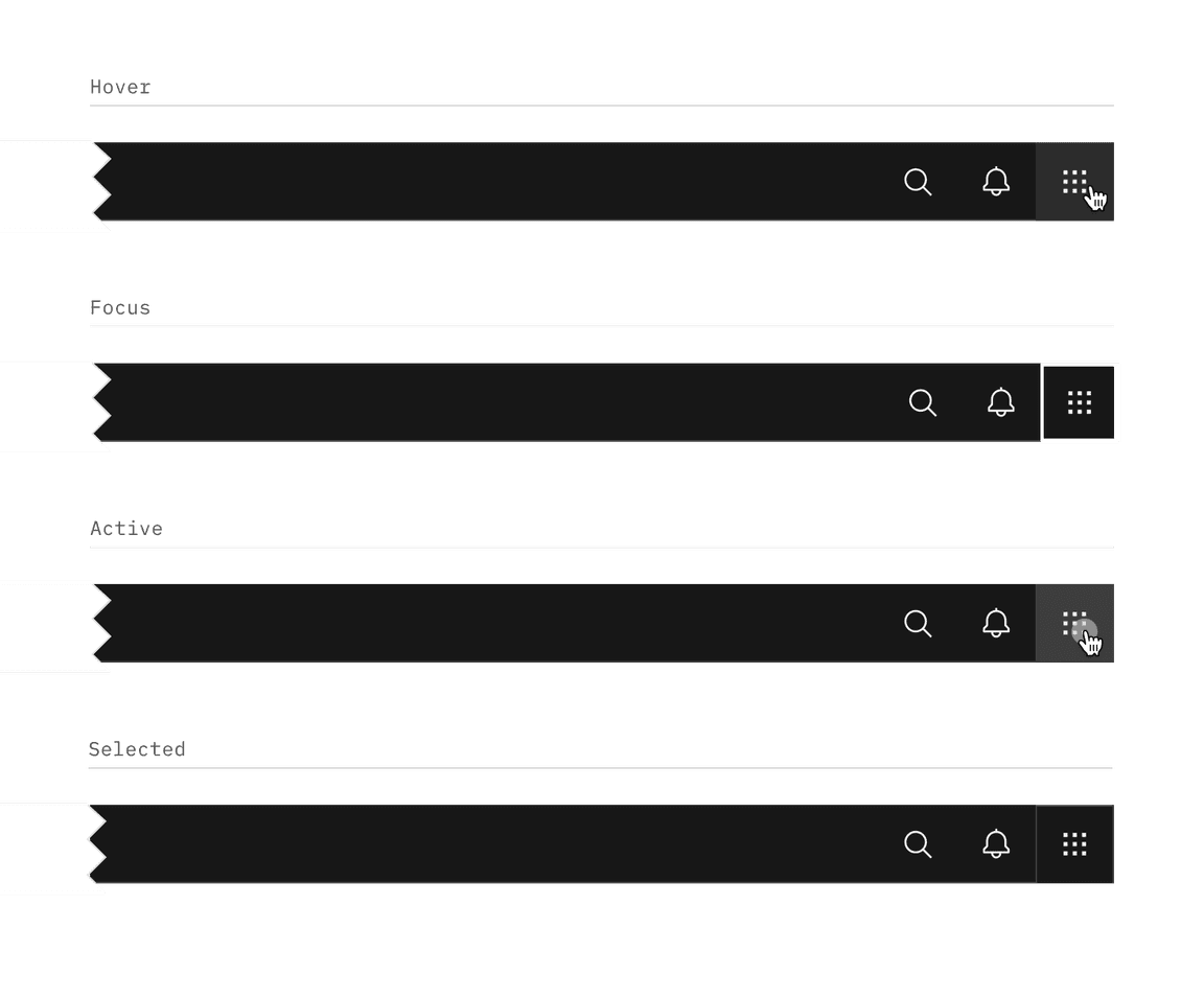
Header action interactive states
Typography
Menu labels and text should be set in sentence case.
| Element | Font-size (px/rem) | Font-weight | Type token |
|---|---|---|---|
| Product name | 14 / 0.875 | SemiBold / 600 | $heading-compact-01 |
| Company prefix | 14 / 0.875 | Regular / 400 | $body-compact-01 |
| Header link | 14 / 0.875 | Regular / 400 | $body-compact-01 |
| Sub-menu | 14 / 0.875 | Regular / 400 | $body-compact-01 |
Structure
The header should span the full width of the browser window. The header can either stay sticky to the top of the browser or scroll away.
| Element | Property | px/rem | Spacing token |
|---|---|---|---|
| Header | height | 48 / 3 | – |
| Menu | height, width | 48 / 3 | – |
| Product name | padding-left | 16 / 1 | $spacing-05 |
| padding-right | 32 / 2 | $spacing-07 | |
| Link | padding-left, padding right | 16 / 1 | $spacing-05 |
| Sub-menu | padding-left, padding right | 16 / 1 | $spacing-05 |
| Chevron | padding-left | 8 / 0.5 | $spacing-03 |
| Sub-menu item | padding-left, padding right | 16 / 1 | $spacing-05 |
| Header action | height, width | 48 / 3 | – |
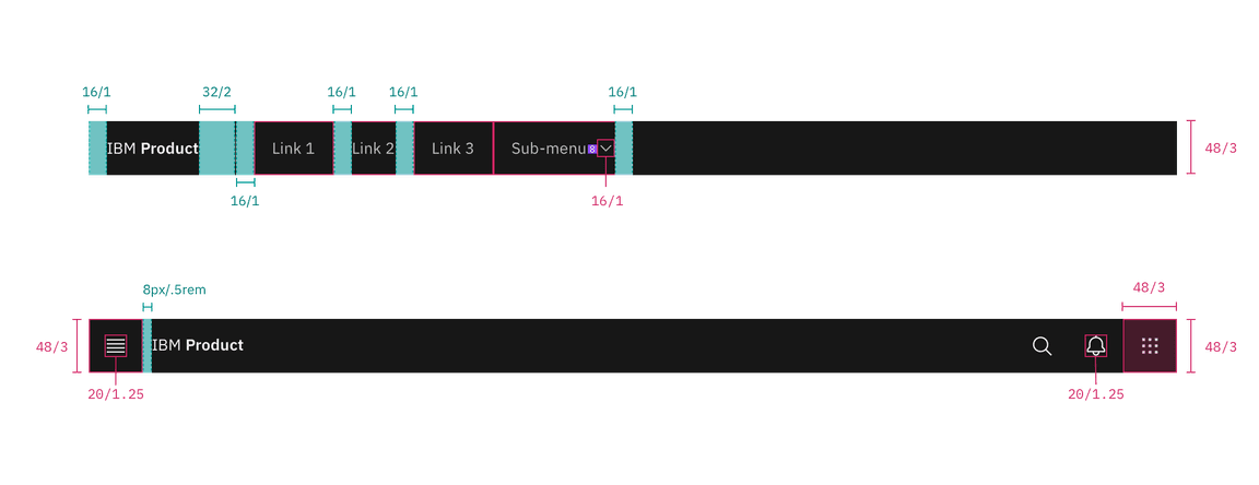
Structure and spacing measurements for UI shell header | px | rem
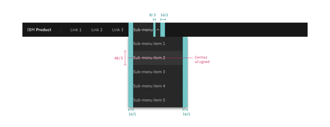
Structure and spacing measurements for header submenu | px | rem
Responsive behavior
In smaller browser windows, menu items in the header should collapse into the
left side nav menu. Items that were once in the header should stack at the top
of the side nav panel if other items were already present in the panel.
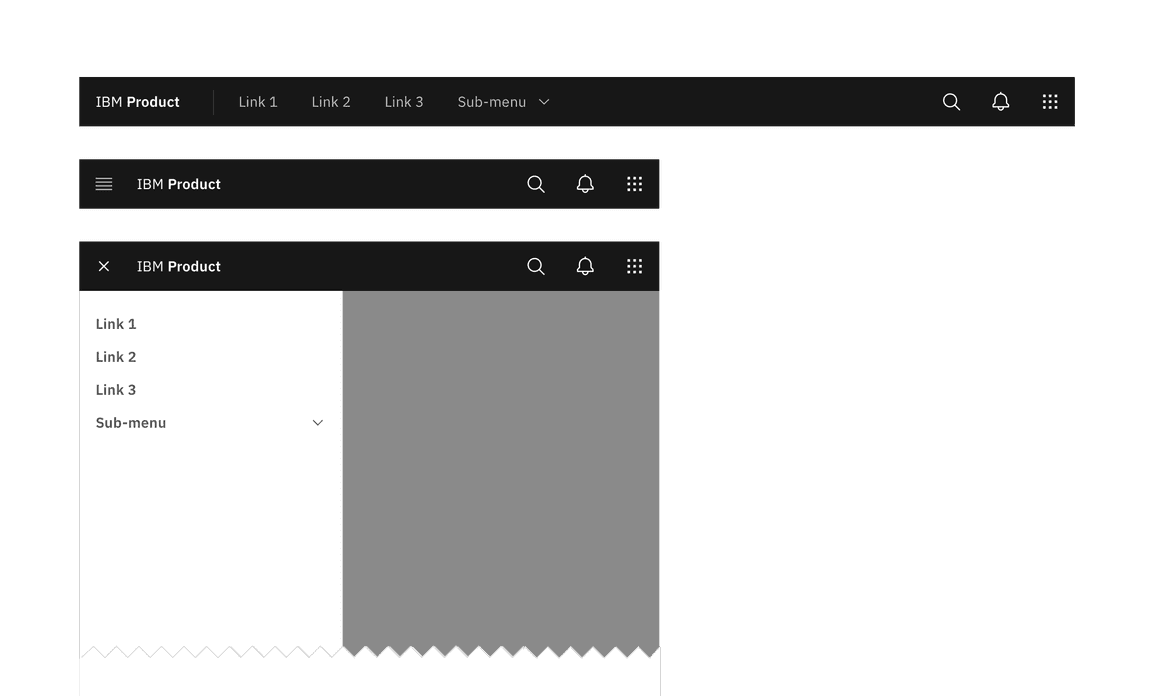
Responsive behavior for UI shell header