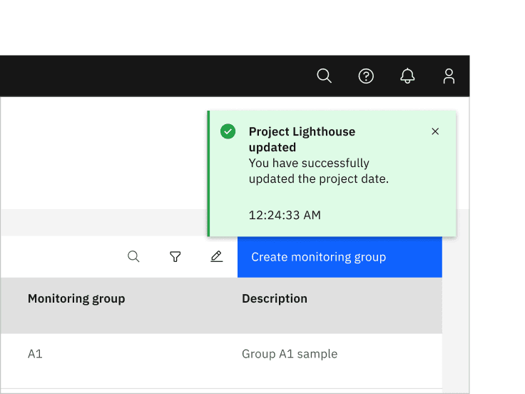
Notification
Notifications are messages that communicate information to the user. The three variants of notifications are toast notifications, inline notifications, and actionable notifications.
- Live demo
- Overview
- Formatting
- Content
- Inline notifications
- Toast notifications
- Actionable notifications
- Universal behaviors
- Modifiers
- Related
- Feedback
Live demo
This live demo contains only a preview of functionality and styles available for this component. View the full demo on Storybook for additional information such as its version, controls, and API documentation.
Accessibility testing statusFor every latest release, Carbon runs tests on all components to meet the accessibility requirements. These different statuses report the work that Carbon has done in the back end. These tests appear only when the components are stable.
For every latest release, Carbon runs tests on all components to meet the accessibility requirements. These different statuses report the work that Carbon has done in the back end. These tests appear only when the components are stable.
Overview
When to use
Use notifications to inform users of updates or changes to system status. Communicating with users and providing immediate feedback are important for building trust. While notifications are an effective method of communicating with users, they are disruptive and should be used sparingly.
For more context on when to use each notification variant, including modals, refer to the notifications pattern. Carbon only supports inline, toast, actionable, and modal notification variants, although some product teams also support banners and notification centers.
Variants
| Variant | Purpose |
|---|---|
| Inline | Inline notifications show up in task flows, to notify users of the status of an action. They usually appear at the top of the primary content area. |
| Toast | Toasts are non-modal, time-based window elements used to display short messages; they usually appear at the top of the screen and disappear after a few seconds. |
| Actionable | Actionable notifications allow for interactive elements within a notification styled like an inline or toast notification. |
Formatting
Anatomy
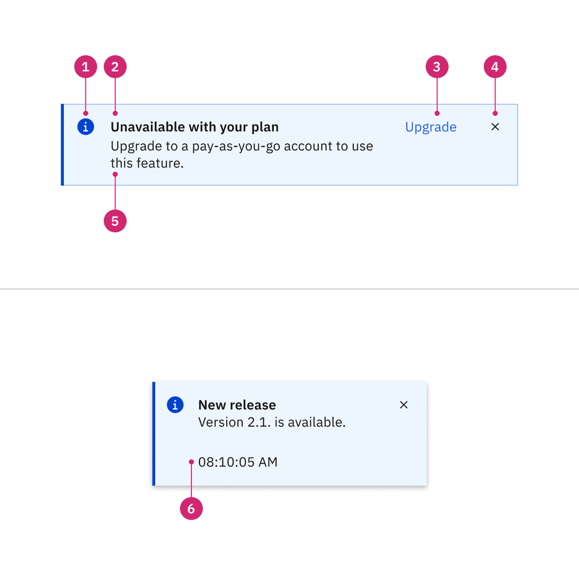
- Icon: Informs users of the kind of notification at a glance.
- Title: Gives users a quick overview of the notification.
- Action (actionable only): Ghost or tertiary button that allows users to address the notification or navigates them to a page with further details.
- Close button (optional): Closes the notification.
- Message: Provides additional detail and actionable steps for the user to take.
- Timestamp (optional for toast): Shows the time the toast notification was sent.
Content
Notifications provide limited space for content, and therefore the content must be short and concise. A user should be able to quickly scan the notification, be apprised of the situation, and know what to do next.
Main elements
Title
- The title should be short and descriptive, explaining the most important piece of information.
- When possible, communicate the main message using just the title.
- Don’t use a period to end a title.
- When using rich text, such as in a title, a screen reader will read aloud the entire message as one sentence. Since the message will be read as one string, make sure that any text styling does not convey meaning.
Body content
- Be concise and avoid repeating or paraphrasing the title.
- Limit content to one or two short sentences.
- Explain how to resolve the issue by including any troubleshooting actions or next steps. You can include links within the notification body that redirect the user to next steps by using an actionable notification.
Action (actionable only)
- Only actionable notifications can contain interactive elements such as a link or button.
- Keep labels concise and clearly indicate the action the user can take.
- Limit action labels to one or two words. For a list of recommended action labels, see Carbon’s content guidelines.
Overflow
If a toast or inline notification requires a message longer than two lines, use an actionable notification and include a short message with a “View more” link that takes the user to a view of the full notification message. This can be either a full page with more details or a modal.
Further guidance
For further content guidance, see Carbon’s content guidelines.
Inline notifications
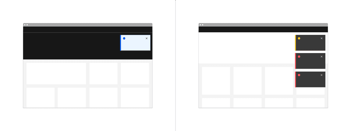
Inline notifications show up in task flows, to notify users of the status of an action or system. They usually appear at the top of the primary content area or close to the item needing attention.
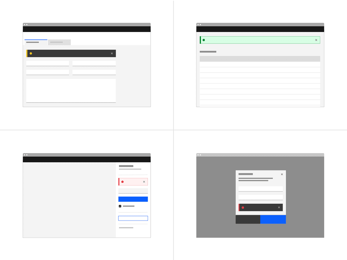
Inline formatting
Sizing
The width of inline notifications varies based on content and layout. They can expand to the fill the container or content area they relate to. Their height is based on the content length, which should not exceed two lines of text.
Placement
Inline notifications appear near their related items. They can expand to fill the width of the container or content area they are in and should align to the grid columns.
We recommend placing inline notifications at the bottom of forms, just above the submission and cancel buttons. When error notifications apply to individual text inputs, they should supplement the error state on that specific input field.
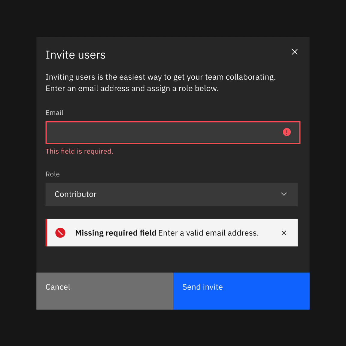
Example of an inline notification supporting an error message on a form
Dismissal
Inline notifications do not dismiss automatically. They persist on the page until the user dismisses them or takes action that resolves the notification.
A small “x” in the top right corner is used to dismiss inline notifications. Including the close button is optional and should not be included if it is critical for a user to read or interact with the notification.
Toast notifications
Toasts are non-modal, time-based window elements used to display short messages; they usually appear at the top of the screen and disappear after a few seconds.
Toast formatting
Time stamp
Toast notifications can include a time stamp at the bottom the container. The time stamp shows the time the notification was sent. Using time stamps is optional but toasts should be consistent across the product so either all toasts should include time stamps or none of them should. The time stamp is optional and can be removed if a third line of content is needed.
Sizing
Toast notifications use a fixed width and their height depends on the length of the notification message. As noted in the content guidelines, limit toast notifications to two lines of text.
Placement
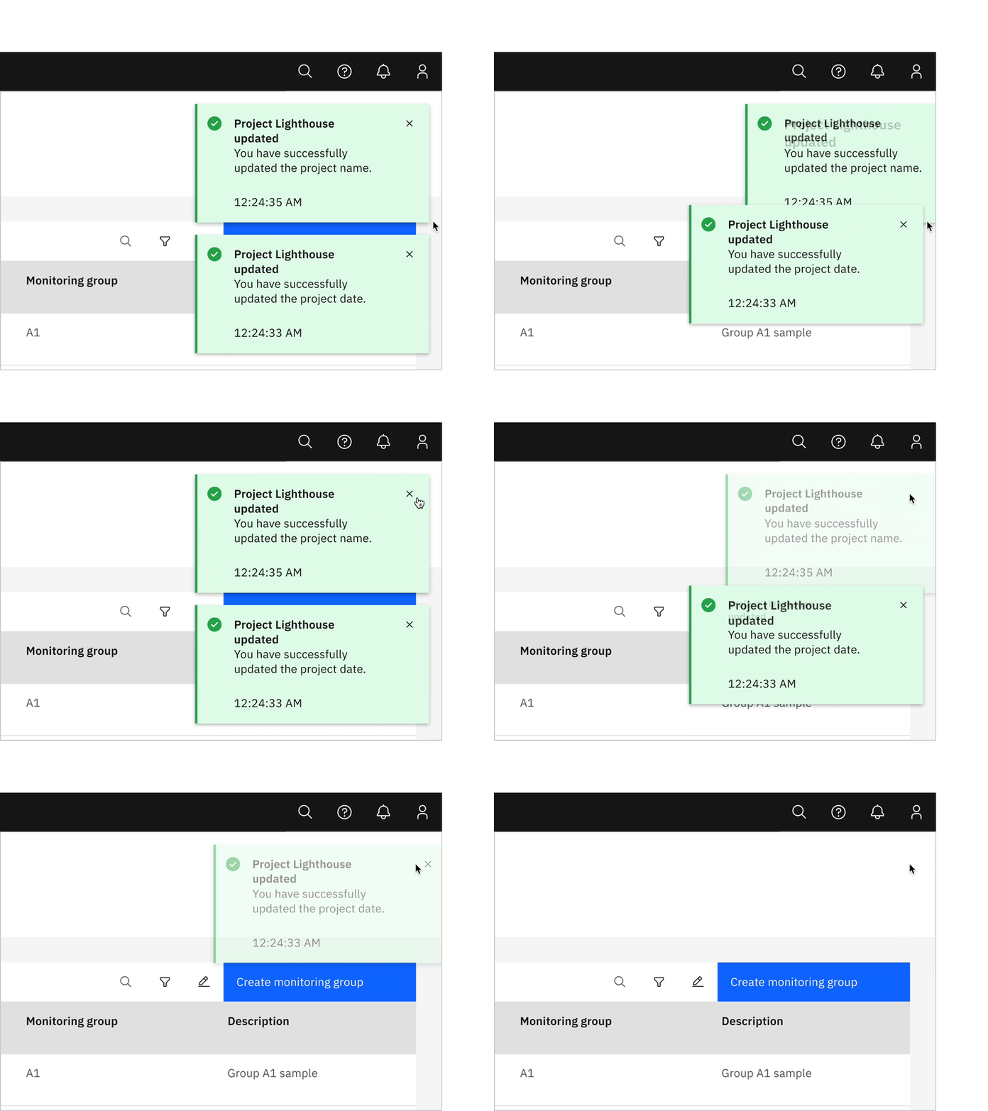
Toast notifications slide in and out from the top right of the screen. They
stack with $spacing-03 in-between. New toast notifications should appear at
the top of the list, with older notifications being pushed down until they are
dismissed.
Dismissal
Toast notifications persist by default. Toasts do have the option to timeout and dismiss automatically after five seconds on the screen. They can also include a close button so users can dismiss them sooner. Toasts cover content on the screen so they should always be easily dismissed. Because toast notifications can dismiss automatically, users should be able to access them elsewhere after the toast disappears. This allows them to be accessible for users who need more time reading the notification or who may want to refer back to the notification.
Actionable notifications
Actionable notifications allow for interactive elements within a notification styled like an inline or toast notification. Actionable notifications, since they require user interaction, take focus when triggered and can be highly disruptive to screen readers and keyboard users. With actionable notifications, only one action is allowed per notification. This action frequently takes users to a flow or page related to the message, where they can resolve the notification. Consider using a notification center where a user can revisit and act on past notifications.
Formatting
Inline
Actionable inline notifications have a ghost button action that is adjacent to the title and body content. On mobile screens the action button wraps under the body content. This button should allow users to take further action on the notification.
Toast
Actionable toast notifications can include a button at the end of their body content. This button should be short and navigate users to a page or modal where they can take action to address the notification or find further information. Because toast notifications automatically dismiss, it is important that there are alternative routes to navigate to the link destination.
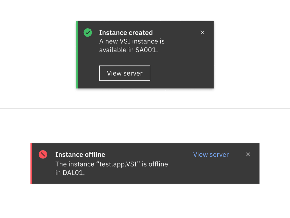
Actionable toast notification (top); actionable inline notification (bottom)
Dismissal
All notifications, including actionable, persist by default until a user dismissed them. If using inline styling refer to inline notifications for inline dismissal. If using toast styling for an actionable notification, then the notification should remain on screen until the user dismisses it. With the notification remaining open, the user has enough time to interact with the button without the toast closing too soon. Refer to toast notifications for further information.
Universal behaviors
Interactions
Mouse
Notifications are system generated. A user can close a dismissible notification
by clicking the close x
Keyboard
For actionable notifications, the action gets focus first. Use Tab to move
between action and the close x. To close notifications, press Enter
or Space while the close x has focus or use the Esc key.
Screen readers
VoiceOver: To close notifications, press Enter or Space while the close x
has focus or use the Esc key.
JAWS: To close notifications, press Enter or Space while the close x has
focus or use the Esc key.
NVDA: To close notifications, press Enter or Space while the close x has
focus or use the Esc key.
Modifiers
High and low contrast
Carbon supports high and low contrast style notifications. High-contrast notifications are best for critical messaging while low-contrast notifications are less visually disruptive for users.
It’s up to the product team to decide which notification style to use in their product. Inline and toast notifications can use different styles but you should never mix styles within each notification variant. When in doubt, use low-contrast notifications.
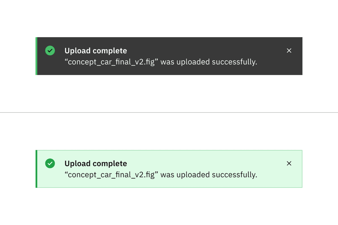
High contrast notification (top); low contrast notification (bottom)
Related
Feedback
Help us improve this component by providing feedback, asking questions, and leaving any other comments on GitHub.
